Paid Ads Landing Page Optimization: A Practical Conversion Guide for Small Businesses
Paid traffic is expensive when the landing page does not finish the job. A campaign can have relevant keywords, strong creative, and a healthy click-through rate, yet still lose money because visitors arrive on a page that feels confusing, slow, or disconnected from the ad.
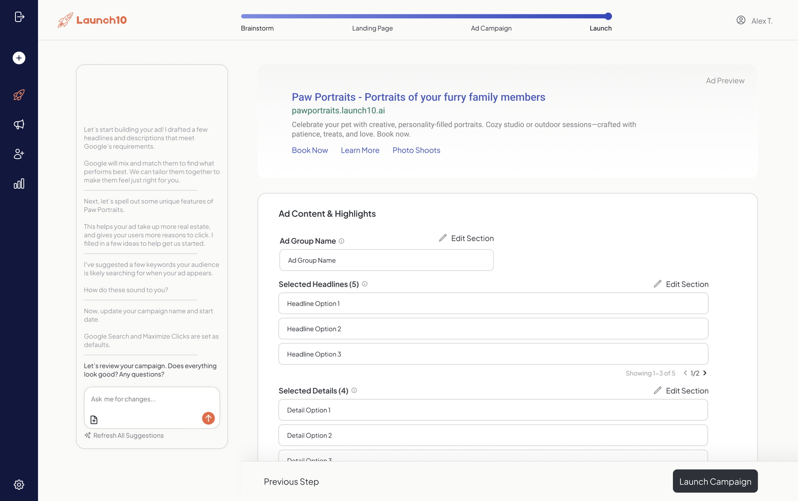
Paid ads landing page optimization is the process of improving the page a visitor sees after clicking an ad. The goal is simple: make it easy for the right visitor to understand the offer, trust the business, and take the next step.
This guide explains how to improve landing pages for Google Ads, Meta Ads, LinkedIn Ads, and other paid channels without relying on tricks. You will learn how to match the message to the ad, choose the right call to action, improve forms, build trust, reduce friction, and run tests that produce useful learning.
Why the Landing Page Matters More Than Many Advertisers Think
Advertising platforms can help you reach a target audience, but they cannot repair a weak destination. After the click, the landing page becomes the salesperson, receptionist, product guide, and trust builder.
A good page should answer four questions fast:
- What is this offer?
- Is it relevant to me?
- Why should I trust this business?
- What should I do next?
If any answer is unclear, the visitor may leave even when the ad was excellent.
Start With Message Match
Message match means the landing page continues the promise made in the ad. The wording does not need to be identical, but the topic, offer, audience, and next step should feel consistent.
Weak example
A user clicks an ad that says “Book a Same-Day HVAC Repair in Phoenix” and lands on a home page that promotes installation, maintenance plans, commercial systems, financing, and company history. The user has to search for the repair option.
Stronger example
The same ad sends the user to a dedicated repair page with a headline such as “Same-Day HVAC Repair in Phoenix,” a phone button, service hours, common repair issues, technician credentials, and a short booking form.
The second page feels like a natural continuation of the ad.
Choose One Primary Conversion Goal
A landing page works better when it has one main action. That does not mean the page can only contain one button. It means the buttons should mostly support the same goal.
Common primary goals include:
- book an appointment
- request a quote
- start a free trial
- buy a product
- call the business
- download a useful resource
- register for a webinar
If the page asks visitors to call, subscribe, read five blog posts, follow social accounts, download a PDF, watch a video, and browse services, attention becomes scattered.
Write a Clear Hero Section
The top section of the page should communicate the offer before the visitor scrolls too far. A useful hero often contains:
- a specific headline
- a short supporting statement
- one primary call to action
- a relevant image or product visual
- one or two trust cues
A practical headline formula
You can use this structure:
Get [desired result] with [service or product] for [audience or location]
For example: “Get Monthly Bookkeeping Support for Growing Service Businesses.”
Avoid vague headlines such as “Grow Better Today” unless the supporting copy explains the offer immediately.
Use Benefits Without Hiding Important Details
Good landing pages explain benefits, but they should not hide practical information. A visitor may need to know what is included, who the offer is for, how long it takes, what the process looks like, and whether there are important limits.
For a software trial, a useful section might explain:
- what features are included
- whether a credit card is required
- how long the trial lasts
- what happens when the trial ends
Clarity can improve lead quality because visitors know what they are choosing.
Keep Forms as Short as the Decision Allows
Every field adds work. That does not mean every form should have only two fields. The right form length depends on the value of the lead and what the business needs to respond well.
For a simple local service
A form may only need:
- name
- phone or email
- service type
- short message
For a high-value B2B service
You may also need company size, role, current system, budget range, or timeline. The key is to collect fields that improve qualification, not fields that are merely interesting to the sales team.
Build Trust Near the Decision Point
Trust is especially important for users who arrive from paid ads because they may not know the brand.
Useful trust signals include:
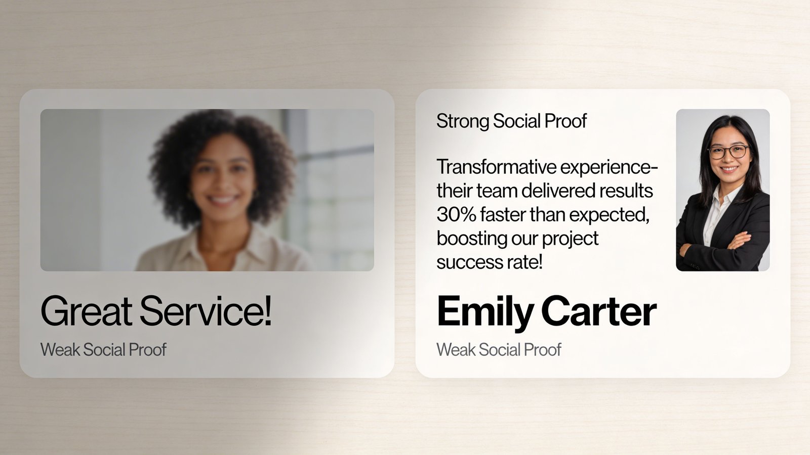
- real customer reviews
- recognized certifications
- clear contact information
- company address when relevant
- privacy and refund information
- real team or product photos
- specific case results with context
- secure payment indicators for ecommerce
Do not use fake counters, invented testimonials, or logos of brands that are not genuine customers or partners.
Improve Mobile Experience First
Many paid clicks come from mobile devices. A landing page that looks fine on a laptop may be difficult on a phone.
Check the mobile page for:
- text that is easy to read without zooming
- buttons large enough to tap
- forms that work with mobile keyboards
- no content hidden behind sticky elements
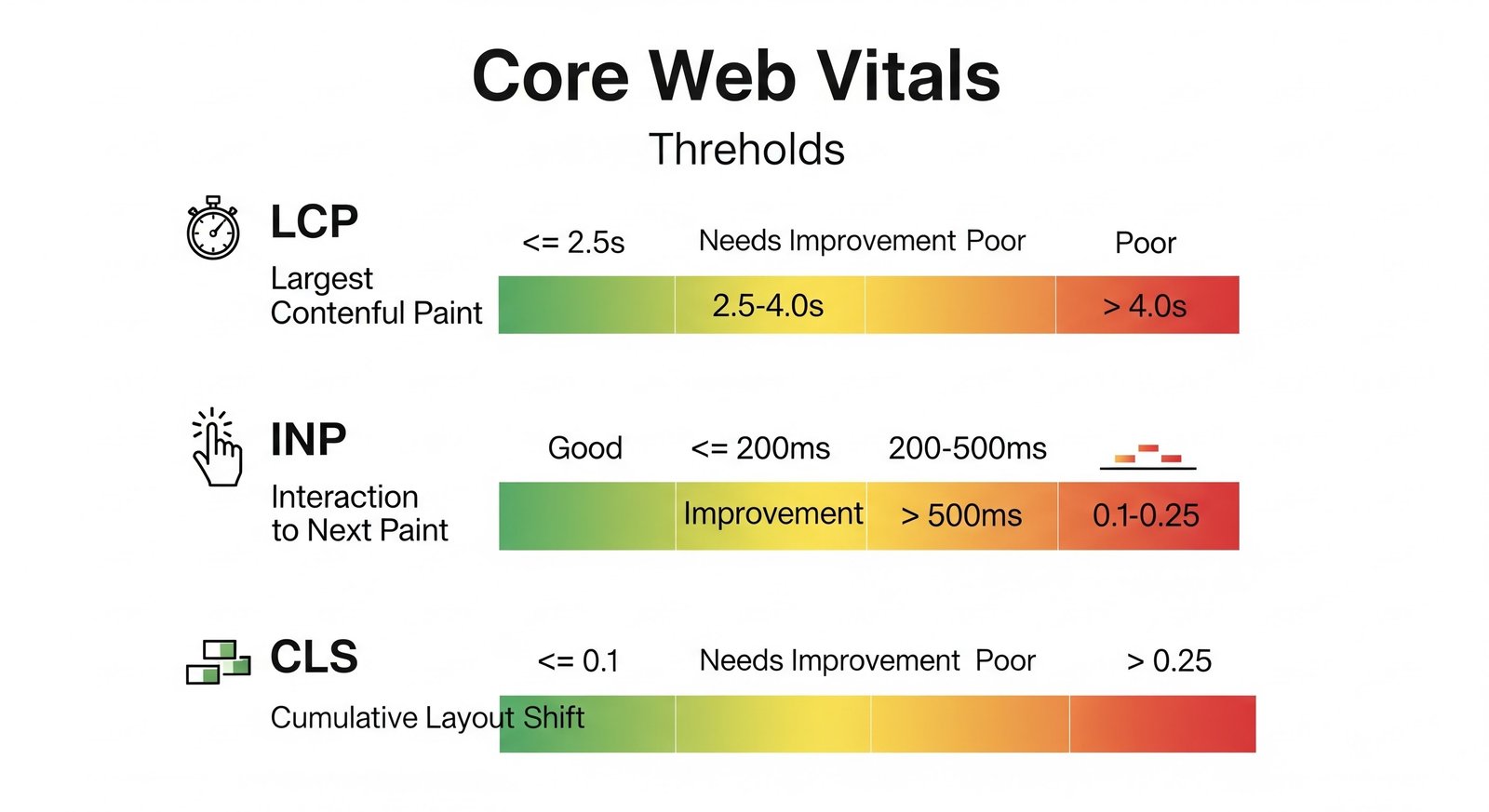
- fast loading on normal mobile connections
- images that do not shift the layout while loading
You can use PageSpeed Insights to review performance signals and Google Search tools for related diagnostics where available.
Make the Page Fast Enough to Use Comfortably
Page speed affects both user experience and advertising efficiency. A visitor who waits too long may leave before seeing the offer.
Start with practical fixes:
- Compress large images.
- Use modern image formats where supported.
- Remove scripts you do not need on the landing page.
- Delay non-essential third-party widgets.
- Use reliable hosting and caching.
- Limit heavy autoplay video backgrounds.
Do not remove useful content just to chase a perfect speed score. Balance speed with clarity and trust.
Match the Page to Traffic Temperature
Not every visitor needs the same amount of information.
High-intent search traffic
A person searching “emergency plumber near me” may need a phone number, service area, availability, price expectations, and trust proof quickly.
Cold social traffic
A person who sees a Meta or TikTok ad may not be actively looking for the product. This visitor may need more education, examples, comparisons, and proof before taking action.
Landing page length should follow the decision, not a fixed rule.
Use Real Proof Instead of Generic Claims
“Best service” is weak because anyone can say it. Specific proof is stronger.
Examples of useful proof:
- “4.8 average from 230 verified reviews” if true
- “Serving the Denver area since 2014” if accurate
- before-and-after case details
- screenshots of real product workflows
- short customer stories
When using review platforms or recognized organizations, link names to reliable sources when it helps the reader verify information.
Reduce Friction Around the Call to Action
A visitor may want the offer but hesitate because the next step is unclear.
Near the call to action, explain:
- what happens after submission
- how long a response usually takes
- whether the call is free
- whether payment is required
- whether the person can cancel
For example: “Submit the form and our coordinator will call within one business day to confirm your appointment.” This reduces uncertainty.
Use a Simple Landing Page Structure
A practical service-business landing page could follow this order:
- Headline and main call to action
- Short explanation of the service
- Key benefits
- How the process works
- Proof and reviews
- Common questions
- Final call to action
An ecommerce or SaaS page may use a different sequence, but the principle remains the same: answer the next question before asking for the next commitment.
Track the Right Conversion
A landing page cannot be optimized well if conversion tracking is incomplete. Configure the actions that matter using platform tools such as Google Ads, Meta Business Suite, or your analytics platform.
Track meaningful events such as:
- form submissions
- qualified phone calls
- purchases
- trial activations
- booked appointments
A button click alone may not equal a lead. Whenever possible, measure the completed action.
Test One Major Idea at a Time
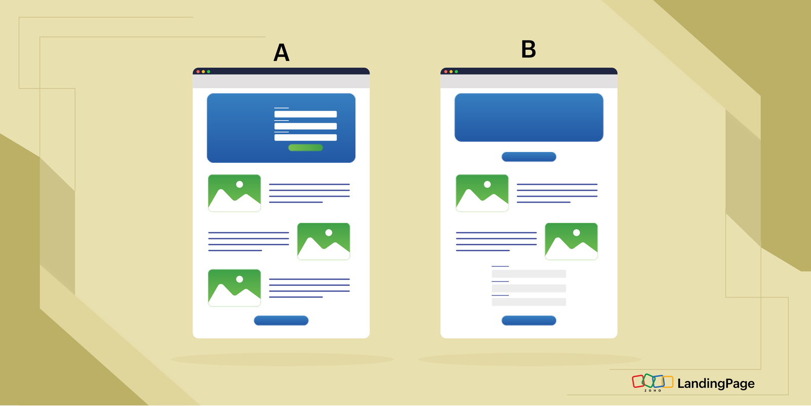
A/B testing is useful when you have enough traffic to learn from it. Do not change the headline, form, price, images, and call to action all at once if you want to know what caused the result.
Useful tests include
- headline clarity
- form length
- call-to-action wording
- proof placement
- offer framing
- page layout
Keep a record of the hypothesis, change, date, traffic source, and result.
What to Do When Conversion Rate Is Low
Step 1: Check traffic quality
Review keywords, audiences, placements, locations, and devices. A landing page cannot convert irrelevant traffic efficiently.
Step 2: Check message match
Compare the exact ad with the page headline and offer.
Step 3: Check technical issues
Test forms, phone links, payment flow, and mobile layout.
Step 4: Watch user behavior
Analytics can reveal high exits, weak scroll depth, or form abandonment. Use behavior data to form a hypothesis rather than guessing.
Step 5: Speak to real customers
Ask what almost stopped them from buying or contacting you. Their answers often reveal missing information.
Real-World Scenario: Home Cleaning Service
A cleaning company runs a paid search campaign for “move-out cleaning.” The ad is specific, but the landing page is the company home page. Visitors must click through several sections to find move-out service details.
The business creates a focused page with:
- move-out cleaning checklist
- service area
- starting-price guidance
- what is and is not included
- booking form
- real customer reviews
The company also changes the form button from “Submit” to “Check Move-Out Cleaning Availability.” The new page does not promise more than the service can deliver. It simply makes the decision easier.
Common Landing Page Mistakes
- Sending all campaigns to the home page
- Using a vague headline
- Adding too many competing calls to action
- Making mobile forms difficult
- Hiding important price or eligibility information
- Using stock images that do not match the service
- Publishing fake urgency
- Ignoring privacy information
- Changing the page without checking tracking
- Testing with too little traffic
A Practical Landing Page Checklist
- Does the headline match the ad?
- Is the primary action obvious?
- Does the page load well on mobile?
- Are forms working?
- Is trust proof real and specific?
- Are important terms clear?
- Is the page free from broken links?
- Does the confirmation page or message work?
- Is conversion tracking firing correctly?
- Can the visitor understand the next step?
FAQs About Paid Ads Landing Pages
Should every ad campaign have its own landing page?
Not always. Several campaigns can share a page when they have the same audience, offer, and intent. Separate pages are useful when the promise or user need differs.
Should I remove the main website navigation?
It depends. For focused lead-generation pages, reducing navigation can keep attention on the main action. For high-consideration services, useful navigation may build trust. Test based on the user journey.
What is a good landing page conversion rate?
There is no universal number. It depends on industry, traffic source, offer, price, and conversion definition. Compare against your own baseline and business economics.
Do long landing pages convert better?
Length is not the deciding factor. A page should be long enough to answer the questions required for the decision and no longer than necessary.
Can a better landing page reduce ad costs?
It can improve efficiency by increasing conversion rate and, in some systems, improving relevance or experience signals. Results depend on the campaign and auction.
Conclusion
Paid ads landing page optimization is not about adding more design effects. It is about reducing uncertainty. Match the page to the ad, explain the offer in plain language, show real proof, make the main action easy, and remove technical friction.
Start with the biggest problem you can identify. If the page is slow, fix speed. If visitors do not understand the offer, improve the headline and supporting copy. If forms are abandoned, simplify or clarify them. If the traffic is poor, fix targeting before rebuilding the page.
When the ad and landing page work as one clear experience, paid traffic becomes easier to evaluate and improve.